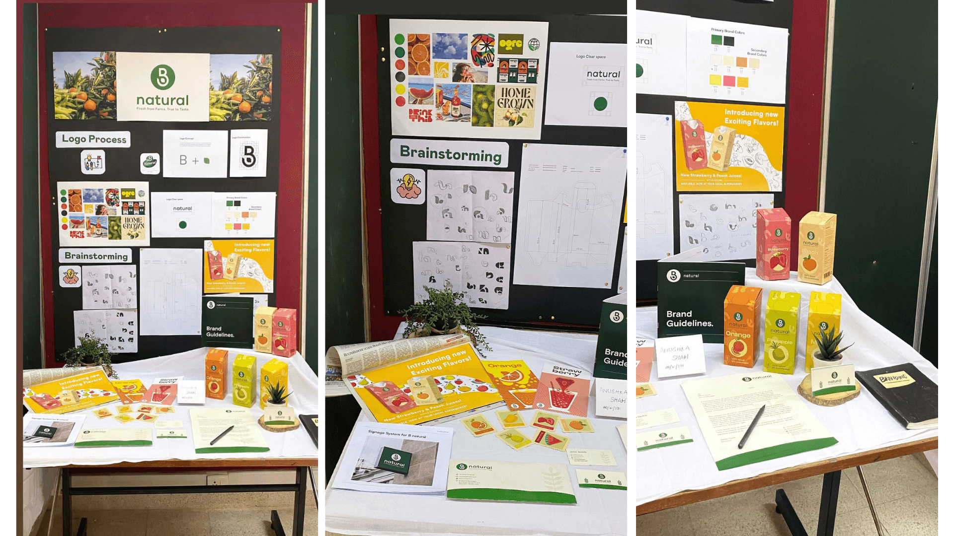
I set out to reimagine B Natural, transforming it from a traditional juice brand into something bold, modern, and vibrant for Gen Z. This younger, health-conscious generation craves authenticity, so I refreshed the identity to match their values.
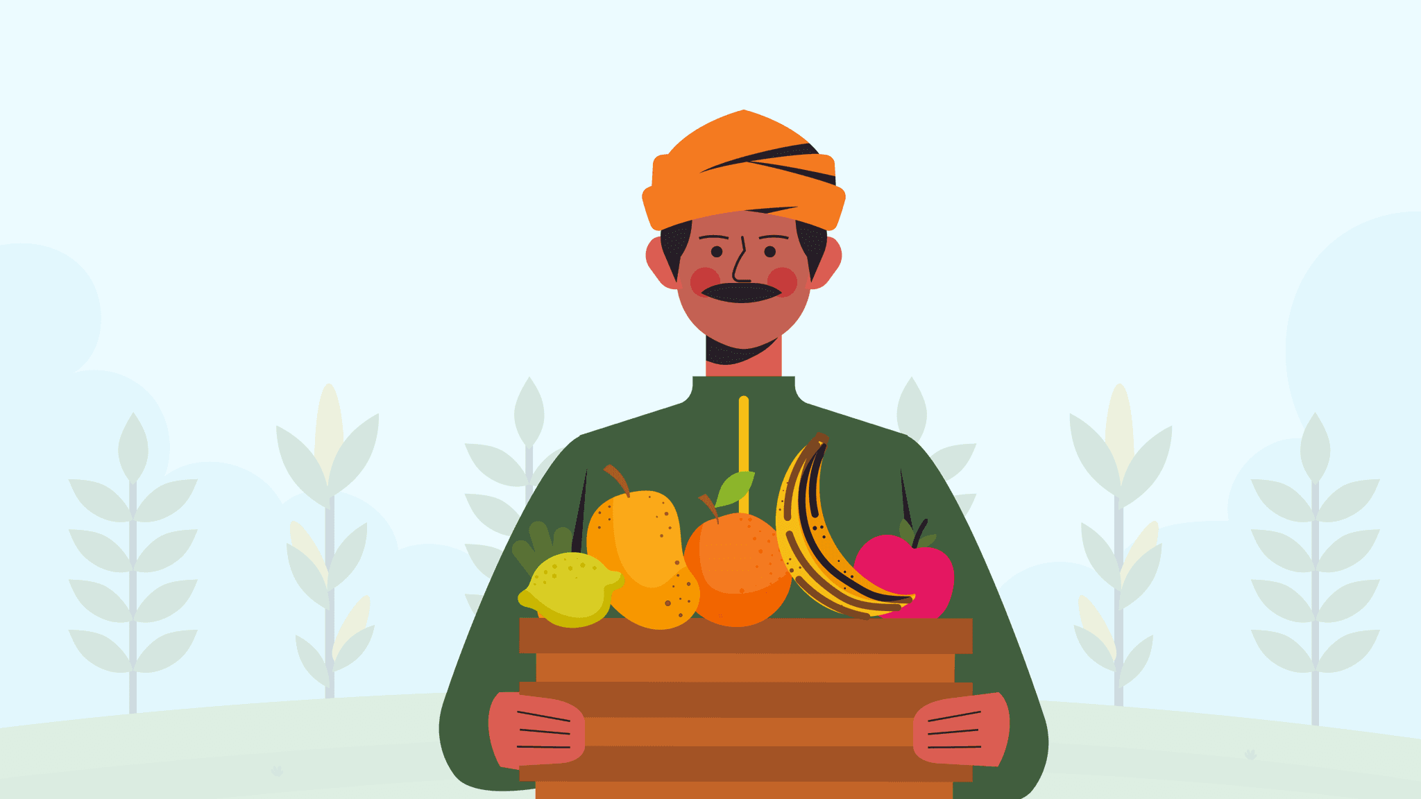
Brand's Target group
Gen-Z health-conscious consumers who are growing, influential consumer base.


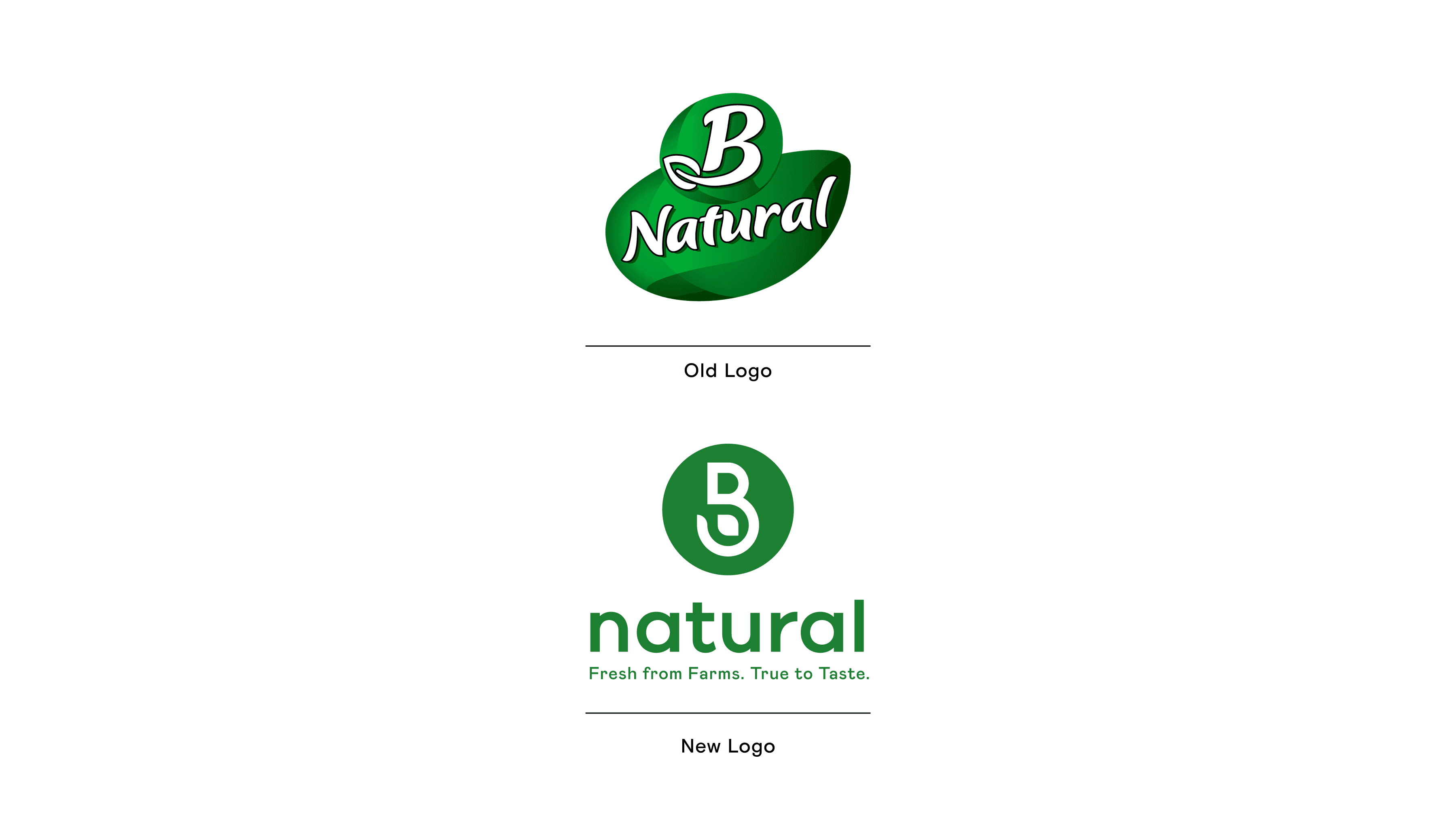
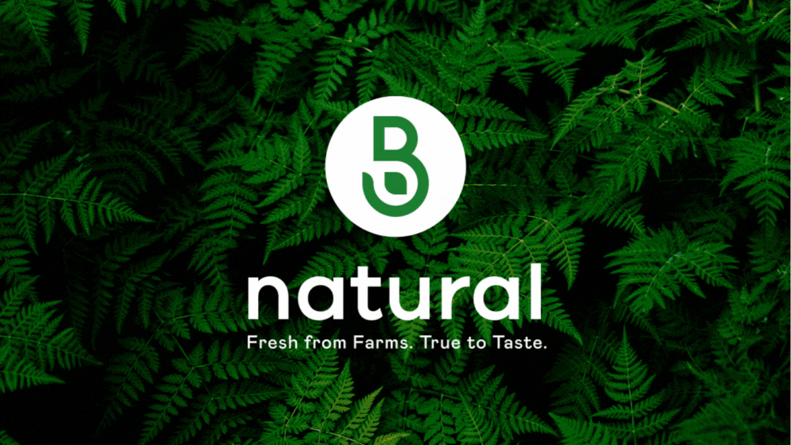
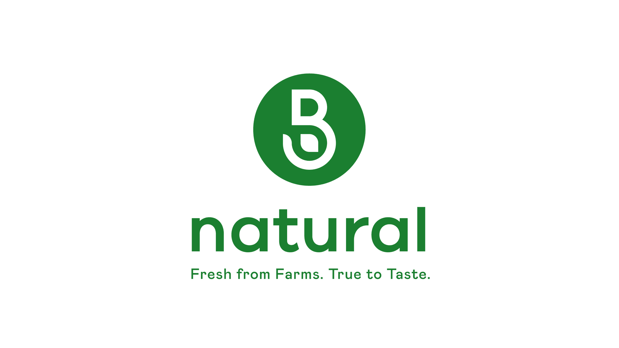
New vs Old logo
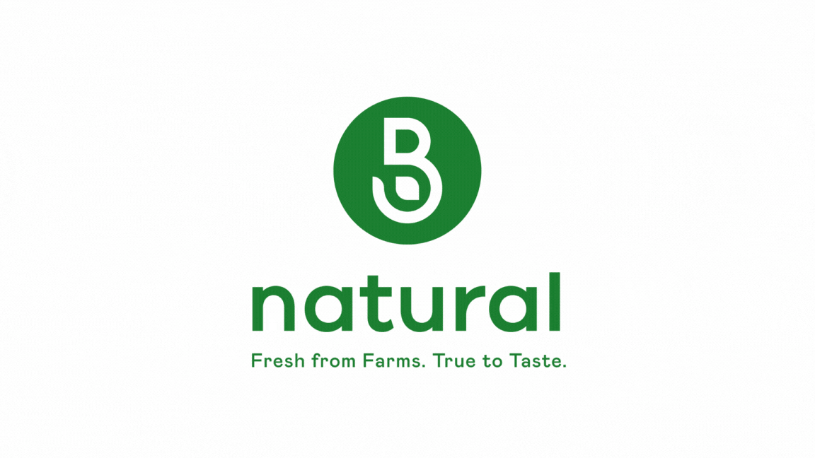
The new B Natural logo is a simple, modern design that reflects the brand’s focus on natural, farm-fresh products, appealing to health-conscious consumers.

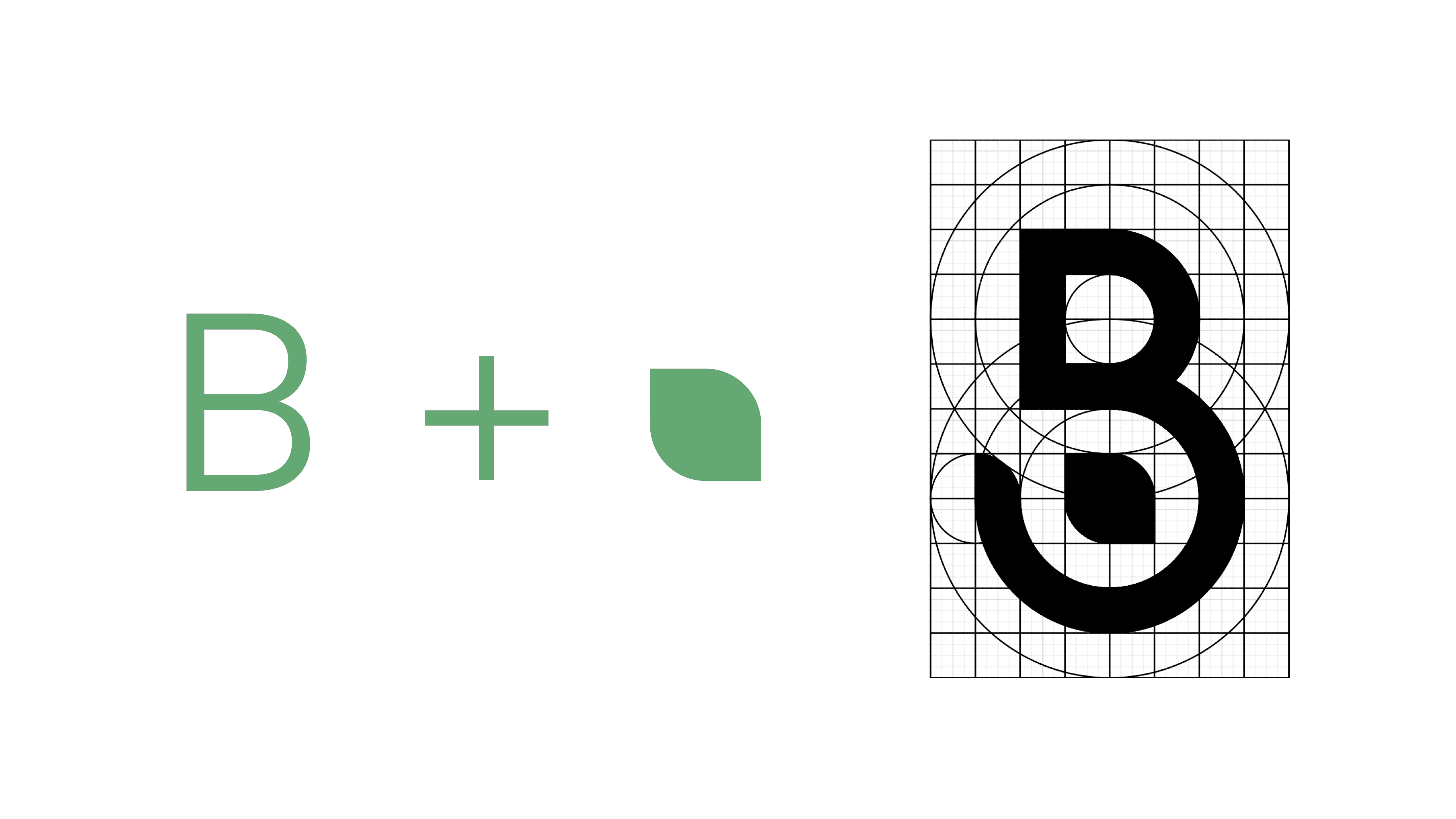
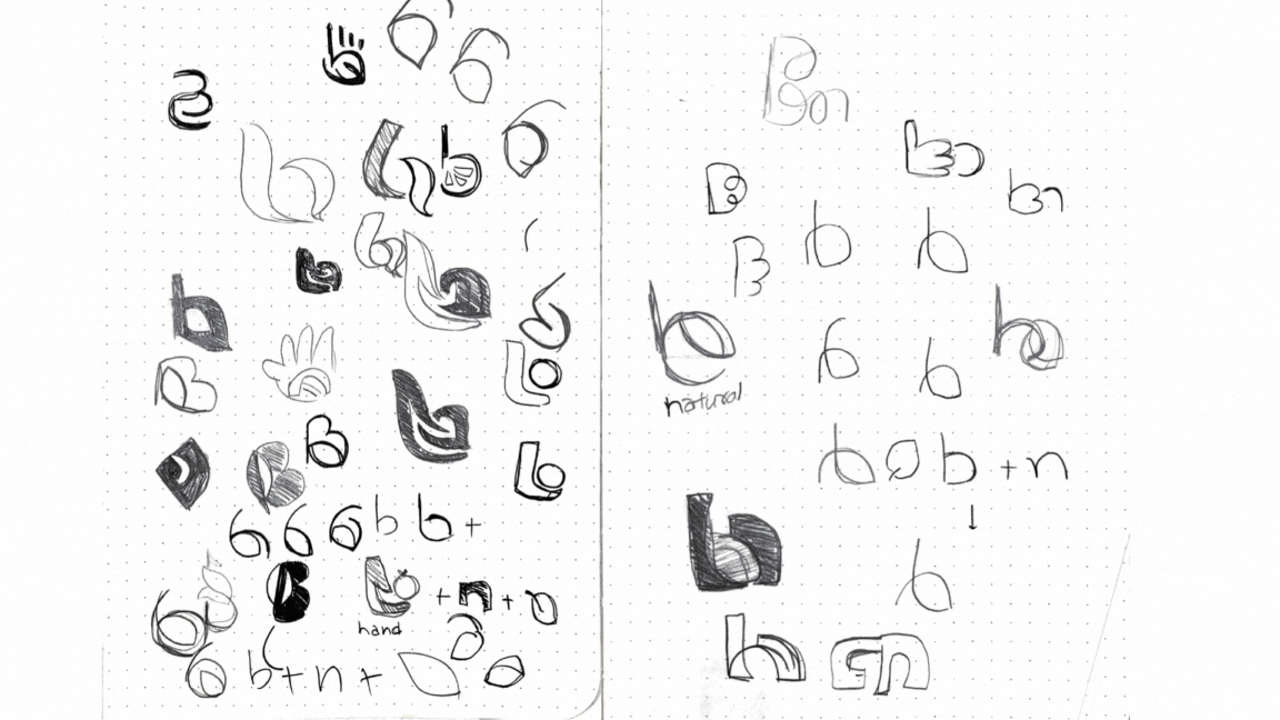
Logo Concept
The green circle represents the holistic approach of the brand towards health and the environment, also indicating a global perspective. The "B" balances the modernity with timelessness, with a leaf embeded depicting the nature.
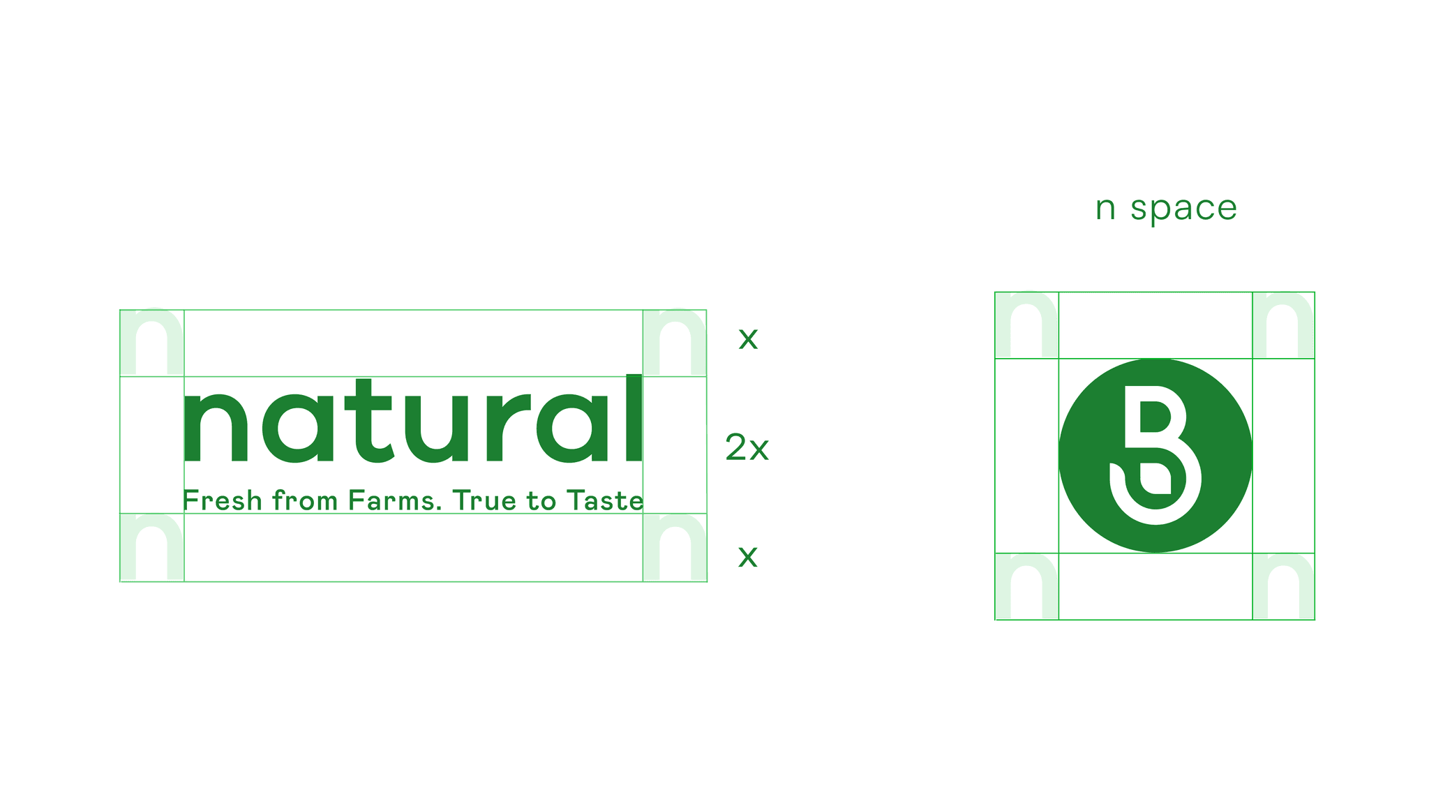

Logo Clear space
The clear space around the B Natural logo ensures visual clarity and impact, maintaining consistency and readability across different applications.
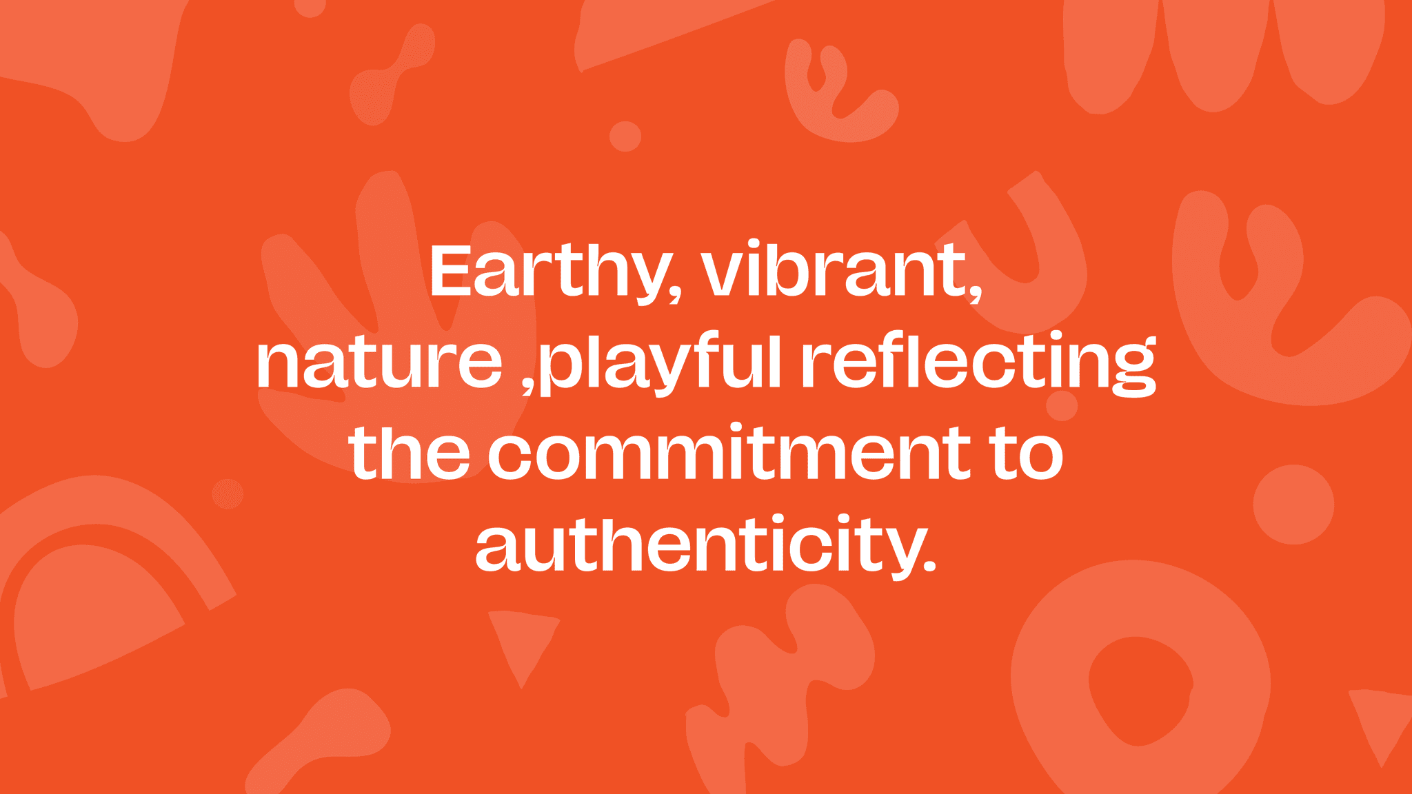
Brand emotion
Earthy, and vibrant,
nature,playful reflecting commitment to authenticity and wellness.
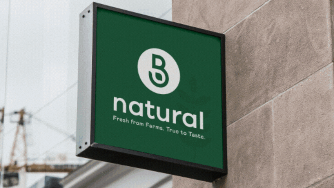
I also designed the Signage System, ensuring clarity and consistency in visual communication across all touchpoints. The system was crafted to enhance wayfinding for a tasting experience center, improve user experience, and align with the brand's modern identity.
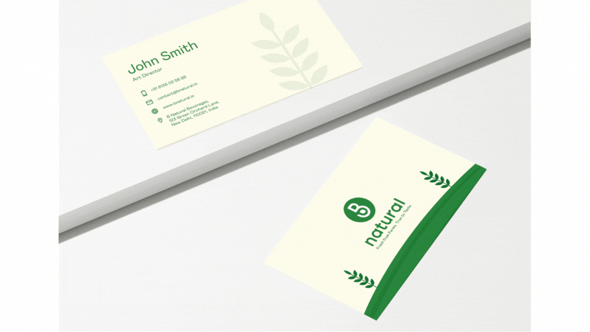
The new packaging and collaterals for B Natural were designed to align with the brand's refreshed identity.